Crafting Your Own Theme in Elyra
Elyra ships with six themes — dark, light, palenight, catppuccin, onedark, and norwegian-midnight. That covers a fair range of moods, from the airy daylight of light to the deep blue dusk of norwegian-midnight. But "a fair range" is not "everyone's range," and sooner or later somebody asks the inevitable question: what if none of these are quite right for me?
The good news is that themes in Elyra aren't compiled assets or buried somewhere in the source. They're just JSON files. One per theme. Drop yours in the right folder and it shows up immediately in the theme selector — no rebuild, no restart, no ceremony.
Here's how it all fits together.
The basics
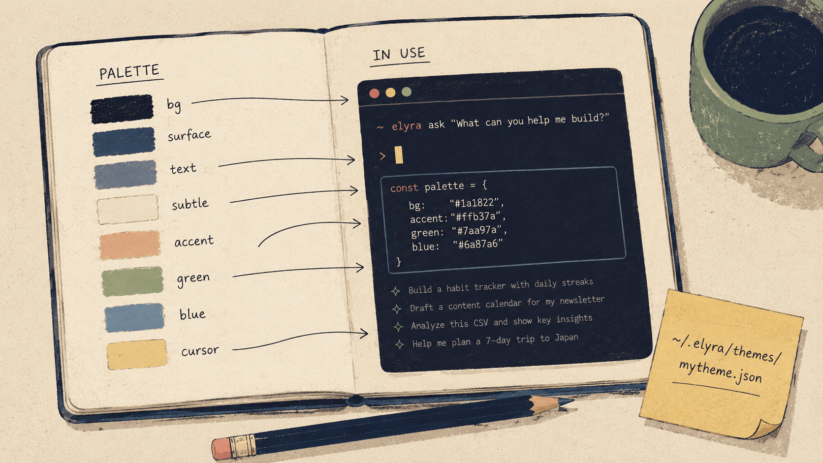
A theme file goes in ~/.elyra/themes/. Name it whatever you want. The filename, minus the .json, becomes the theme name.
~/.elyra/themes/mytheme.json
Once saved, it appears in /theme straight away. The selector previews themes as you arrow through the list, so you can iterate by saving the file, alt-tabbing back to Elyra, and reopening the selector to see what changed.
Starting from an existing theme
You could write a theme from a blank file, with the schema in one tab and a color picker in another. You probably shouldn't. The easier path is to grab a built-in theme that's already close to what you want and edit from there.
The built-in theme files live at packages/coding-agent/src/modes/interactive/theme/ in the Elyra source. Copy whichever one you like into ~/.elyra/themes/ under a new name, and you've got a starting point that already has every required key filled in with sensible values.
If you'd rather start from scratch, here's a minimal theme that gives you a feel for the shape:
{
    "$schema": "https://raw.githubusercontent.com/kwhorne/elyra/main/packages/coding-agent/src/modes/interactive/theme/theme-schema.json",
    "name": "mytheme",
    "vars": {
        "blue": "#61afef",
        "green": "#98c379",
        "red": "#e06c75",
        "yellow": "#e5c07b",
        "purple": "#c678dd",
        "cyan": "#56b6c2",
        "gray": "#7f848e",
        "dimGray": "#5c6370",
        "bg": "#282c34"
    },
    "colors": {
        "accent": "blue",
        "border": "blue",
        "borderAccent": "cyan",
        "borderMuted": "#3e4452",
        "success": "green",
        "error": "red",
        "warning": "yellow",
        "muted": "gray",
        "dim": "dimGray",
        "text": "",
        "thinkingText": "gray",
    "selectedBg": "#2c313a",
    "userMessageBg": "bg",
    "userMessageText": "",
    "customMessageBg": "#28252e",
    "customMessageText": "",
    "customMessageLabel": "purple",
    "toolPendingBg": "#252930",
    "toolSuccessBg": "#252e28",
    "toolErrorBg": "#2e2528",
    "toolTitle": "",
    "toolOutput": "gray",

    "mdHeading": "yellow",
    "mdLink": "blue",
    "mdLinkUrl": "dimGray",
    "mdCode": "green",
    "mdCodeBlock": "green",
    "mdCodeBlockBorder": "gray",
    "mdQuote": "gray",
    "mdQuoteBorder": "gray",
    "mdHr": "gray",
    "mdListBullet": "yellow",

    "toolDiffAdded": "green",
    "toolDiffRemoved": "red",
    "toolDiffContext": "gray",

    "syntaxComment": "#7f848e",
    "syntaxKeyword": "#c678dd",
    "syntaxFunction": "#61afef",
    "syntaxVariable": "#e06c75",
    "syntaxString": "#98c379",
    "syntaxNumber": "#d19a66",
    "syntaxType": "#e5c07b",
    "syntaxOperator": "#56b6c2",
    "syntaxPunctuation": "#abb2bf",

    "thinkingOff": "#3e4452",
    "thinkingMinimal": "#5c6370",
    "thinkingLow": "#7f848e",
    "thinkingMedium": "blue",
    "thinkingHigh": "purple",
    "thinkingXhigh": "#de73ff",

    "bashMode": "green"
},
"export": {
    "pageBg": "#181a1f",
    "cardBg": "#21252b",
    "infoBg": "#2c313c"
}

}
That's the whole shape. Two main sections, an optional third, and a $schema line that pulls its weight in any editor that knows what to do with it.
How the two sections work
vars
The vars section is your palette. It's where you give your colors human-readable names so you don't have to keep typing #61afef everywhere.
"vars": {
"blue": "#61afef",
"green": "#98c379",
"bg": "#282c34"
}
You can put hex codes here (#RRGGBB) or, for terminals stuck in the 256-color era, palette indices from 0 to 255. You can define as many variables as you want, with whatever names make sense to you. Some people name them by hue (blue, green), some by role (primaryBg, accentWarm). Both work fine — vars is just sugar.
colors
The colors section is where the actual work happens. Every key here maps a semantic role — "this is the accent color," "this is what errors look like" — to either a variable name from vars or a hex value used directly.
"colors": {
"accent": "blue",
"error": "#ff0000",
"text": ""
}
Three formats are valid:
Variable reference:
"blue"looks upblueinvars.Direct hex:
"#ff0000"uses the color literally.Empty string:
""means use the terminal's default color.
That last one is more useful than it looks. Setting text or userMessageText to "" lets the terminal's own foreground color come through, which means your theme stops fighting the user's terminal background. The same theme reads cleanly whether their terminal is pure black, dark gray, or the slightly-off-cream that some people swear by.
Every key in colors is required. The schema enforces this — leave one out and validation will tell you exactly which one.
What each color controls
There are 51 required colors in total. That sounds like a lot until you realize they're really six small groups doing six different jobs.
Core UI (11 colors)
The chrome of the application. Accents, borders, status colors, the basic text-and-emphasis vocabulary.
Color What it affects accent Logo, cursor, selected items, list bullets, active elements border Normal borders around tool output, code blocks borderAccent Highlighted borders (active input, focused elements) borderMuted Subtle borders (separators, inactive elements) success Success states, green indicators error Error messages, failed tool calls warning Warnings, caution indicators muted Secondary text, labels, descriptions dim Very faded text (timestamps, meta info) text Default text color (usually empty for terminal default) thinkingText Thinking block text
Backgrounds (8 colors)
The bigger color areas — message backgrounds, tool execution boxes, selection states.
Color What it affects selectedBg Selected item in lists and menus userMessageBg Your messages in the chat userMessageText Your message text color customMessageBg Extension-injected messages customMessageText Extension message text customMessageLabel Extension message type label toolPendingBg Tool execution box while running toolSuccessBg Tool execution box on success toolErrorBg Tool execution box on error
A small piece of advice that took me too long to figure out: for backgrounds, subtle almost always beats expressive. Take your base background color and shift it 10–20 points in one RGB channel toward green for success, red for error, blue or gray for pending. That's usually enough. Anything stronger and the chat starts to feel like a traffic light.
Markdown (10 colors)
How rendered markdown — headings, code, links, quotes — picks up its colors.
Color What it affects mdHeading # Heading text mdLink link text mdLinkUrl The URL part of links mdCode inline code mdCodeBlock Fenced code block content mdCodeBlockBorder The ``` fence lines mdQuote > blockquote text mdQuoteBorder Blockquote border mdHr --- horizontal rules mdListBullet - and 1. list markers
Diffs (3 colors)
The unsung heroes. You'll see a lot of these.
Color What it affects toolDiffAdded + lines in diffs toolDiffRemoved - lines in diffs toolDiffContext Unchanged context lines
Syntax highlighting (9 colors)
The actual code colors inside code blocks.
Color What it affects syntaxComment // comments syntaxKeyword if, return, const, class syntaxFunction Function names syntaxVariable Variable names syntaxString "string literals" syntaxNumber 42, 3.14 syntaxType Type names, class names syntaxOperator +, =, =>, && syntaxPunctuation {, }, ;, ,
If you've ever picked colors for a VS Code theme, these will feel familiar. Most of the work of porting an existing theme happens right here.
Thinking levels (6 colors)
These color the editor's border based on how much thinking is currently enabled. The point is at-a-glance feedback: a quick downward glance should tell you whether you're in low or xhigh without reading anything.
Color Thinking level thinkingOff Off (darkest) thinkingMinimal Minimal thinkingLow Low thinkingMedium Medium thinkingHigh High thinkingXhigh Xhigh (brightest)
The trick here is to make them a gradient — dark and subtle at the bottom, bright and saturated at the top. If low and high look basically the same, the indicator stops indicating.
One more thing
Color What it affects bashMode Editor border color in bash mode (! prefix)
That's the lot. 51 colors, six small groups.
The export section (optional)
If you ever run /export to dump a session as HTML, the output uses its own little palette for the page, the cards, and the info blocks. The export section is where you tune those.
"export": {
"pageBg": "#181a1f",
"cardBg": "#21252b",
"infoBg": "#2c313c"
}
Leave it out and Elyra derives reasonable defaults from userMessageBg. So unless you're picky about your exports, you can skip this section entirely.
Porting a VS Code theme
Honestly, this is how most Elyra themes come into the world. Palenight, Catppuccin, OneDark, Norwegian Midnight — all of them started as VS Code themes that got translated into Elyra's format. The mapping is mostly mechanical:
Elyra VS Code equivalent accent activityBarBadge.background or cursor color bg / userMessageBg editor.background border focusBorder or panel.border muted editorLineNumber.foreground or comment color syntaxKeyword Token color for keyword scope syntaxFunction Token color for entity.name.function scope syntaxString Token color for string scope syntaxComment Token color for comment scope syntaxNumber Token color for constant.numeric scope syntaxType Token color for entity.name.type.class scope syntaxOperator Token color for keyword.operator scope toolSuccessBg editor.background shifted slightly green toolErrorBg editor.background shifted slightly red
Pull the VS Code theme's JSON, find the relevant tokens, paste them into the right Elyra fields. The tokenColors array in VS Code themes can be a bit fiddly — token rules sometimes target multiple scopes, sometimes apply only under specific parents — but for the basics above, the first match is almost always the right one.
A few things I wish someone had told me
Test in the terminal you actually live in. Colors render differently across terminals. iTerm2, Kitty, Alacritty, Ghostty, and the default macOS Terminal all have subtly different ideas about what #61afef should look like. A theme that's gorgeous in Kitty can look washed out in macOS Terminal, and vice versa. Don't tune your theme in one and use it in another.
Use /theme for live preview. Save the file, open the selector, arrow through. The selector previews each theme as you highlight it, so you can compare your work against the built-ins side by side without committing to anything. Cancel out and nothing changes.
Start with backgrounds. Get userMessageBg, toolPendingBg, toolSuccessBg, and toolErrorBg right before you touch anything else. These are the biggest patches of color on screen, and they decide the whole mood of the theme. Everything after that is accent work.
Keep contrast accessible. Your text (or terminal default) needs to be readable on userMessageBg. Your error needs to be readable on toolErrorBg. If your background is dark, your text needs to be light. Obvious, right? It's still the single most common mistake in custom themes. Run your candidate colors through a contrast checker if you're not sure.
The $schema line earns its keep. In any editor that understands JSON Schema — and that's most of them now, including VS Code — that one line gives you autocomplete on every color name and a red squiggle the moment you forget one. Leave it in.
That's really all there is to it. A JSON file, two sections, 51 colors, and a folder that watches itself. The hardest part isn't the schema — it's deciding what you actually want your terminal to feel like at 11pm on a Tuesday. Once you know that, the rest is just typing.
Have fun. ☕