Seeing What You Ship
There's a particular dance that terminal-based development teaches you. You ask the agent to nudge a button's padding, or make a gradient less aggressive, or fix that weird thing happening to the heading at tablet width.
The agent edits some Tailwind classes. Then you alt-tab to the browser, refresh, squint, try to translate "it's still weird" into words the agent can act on, alt-tab back, and go around again.
It works. But it's tiring in a small, persistent way. Like trying to describe a painting to someone over the phone.
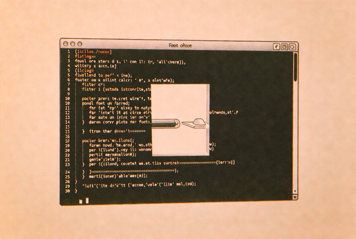
@elyracode/design-tools is a plugin that closes the gap a bit. It teaches Elyra three new tricks: rendering HTML in your browser with live reload, taking screenshots so the agent can actually see what it built, and running a quick consistency pass over your Tailwind classes. Nothing here is glamorous. All three are the kind of small, sturdy tools you reach for daily.
Getting it installed
elyra install npm:@elyracode/design-tools
That's the whole install for the preview tool — it uses Tailwind via CDN, no build step, no config. Screenshots want Puppeteer if you'd like automated captures (npm install -g puppeteer), but the other two tools are entirely self-contained.
Live preview, or: the browser as a window
This is the one you'll reach for first. Ask for something visual and watch it appear:
Preview a pricing table with three tiers: Starter, Pro, and Enterprise
The agent writes the HTML, calls design_preview, and your default browser opens with the rendered thing. The page auto-reloads every two seconds. So when you say "make the Pro tier stand out a bit more" and the agent obliges, the browser just... updates. You never alt-tab. The browser becomes a window onto whatever you're cooking; the terminal stays where you actually live.
A few things this is genuinely lovely for:
Show me a hero section with a gradient from indigo to purple
Preview this component in dark mode
Build a responsive card grid — 1 column on mobile, 3 on desktop
Under the hood, the preview lives at ~/.elyra/design-preview/preview.html. It's a single static HTML file: the Tailwind CDN script tag, your markup, a two-second reload timer. That's the whole machine. Nothing fancy, nothing that can break in interesting ways at 11pm.
The dark parameter flips the page to a dark background. The width parameter caps the container, which is handy when you want to see how something behaves at, say, 480px without dragging your browser window around like a sad accordion.
Screenshots, or: letting the agent see
The preview is for you. Screenshots are for the agent.
Code can pass a careful review and still render slightly off. Misaligned by 2px. Spacing that looks balanced in Tailwind classes but feels wrong on screen. A color pairing that fails contrast in a way the source can't reveal. Reading the code won't catch any of this. Seeing it will.
Take a screenshot of localhost:3000 and check the layout
The agent captures the viewport, gets a PNG back, and looks at it. Properly looks at it. It can flag things the source is silent about — overflowing text, low-contrast pairings, an element that's drifted half a pixel out of alignment.
Responsive checks are particularly satisfying:
Screenshot the dashboard on a mobile viewport
The mobile flag sets a 375×812 viewport (an iPhone, roughly). Or hand it whatever dimensions you want:
Capture localhost:8000/settings at 1920x1080
This shines after a stretch of changes. The agent has been refactoring templates for the last twenty minutes; instead of pulling up each page yourself, take a screenshot and ask the agent to look. It catches regressions that would otherwise take a full coffee to notice.
Screenshots use Puppeteer for the automated captures. There's a fallback on macOS to the built-in screencapture for local files, but Puppeteer is what handles localhost and full-page rendering properly.
The design check, or: someone watching for drift
The third tool is a static once-over of your Tailwind. Hand it a file, get back a list of small inconsistencies:
Check resources/views/dashboard.blade.php for design consistency
What it watches for:
Mixed spacing scales. If a single file uses p-2, p-3, p-5, p-6, p-8, p-10, and p-16, that's seven different values doing roughly the same job. The check flags it and suggests consolidating. Consistent spacing is most of what separates a UI that feels considered from one that feels thrown together.
Missing responsive breakpoints. A grid-cols-3 with no sm: or md: variants stays three columns on a phone. That's almost always a bug.
No focus or hover states. Buttons, links, anything clickable — without focus: or hover: they fail accessibility basics and feel oddly dead to use. The check flags both.
Hardcoded colors. Inline hex values like bg-[#1a2b3c] instead of theme tokens (bg-slate-800) make dark mode and theme swapping miserable later. It counts them.
Missing dark mode. Background colors without dark: variants mean the component just won't adapt. If your project supports dark mode, this finds the gaps you forgot.
Conflicting classes. hidden and block on the same element without responsive prefixes to differentiate them is almost always an accident.
You can also hand it raw HTML instead of a file path:
Check this for Tailwind consistency:
<div class="p-3 m-5 p-8 grid-cols-3 bg-white text-gray-900">
  <button class="bg-[#ff0000] p-2">Submit</button>
</div>
That snippet comes back with: mixed spacing on the div, no responsive grid breakpoints, no hover or focus on the button, a hardcoded red, and no dark mode support. Six lines of HTML, five issues. The kind of thing that accumulates quietly in a real codebase.
The /design command
If you'd rather pick from a menu than describe what you want, there's a slash command:
/design
Pick "Preview," "Screenshot," or "Design Check," and the agent prompts you for the rest. It's mostly there for discoverability — once you know the tools exist, you'll just ask for them in plain English.
A few flows that come up
Prototyping. Building a new page or component. Preview shows it live while you iterate. No dev server needed if you're staying in pure Tailwind.
Visual QA after a refactor. The agent has just rewritten a template or churned through a pile of class changes. Screenshot the result and ask the agent to look it over before you commit.
Design audits. Run the check across your templates to find the slow drift — mixed spacing, missing dark mode, focus states that quietly disappeared during last quarter's hurry.
Handoff verification. A designer handed you a mockup. Preview your implementation, screenshot it, screenshot the mockup, and ask the agent to compare. It's not a substitute for a designer's eye, but it catches the obvious gaps before you book the review.
The three tools work fine separately, but the real shape of them shows up when they're used together. A typical session: ask for a component, preview it, tweak based on what you see, run the design check, fix what it flags, screenshot the final thing for the PR description. All without leaving the terminal, all in one continuous stretch.
The alt-tab dance was never really about typing. It was about your attention having to live in two windows at once. These tools don't replace the browser — they just stop making it the place you have to think in.